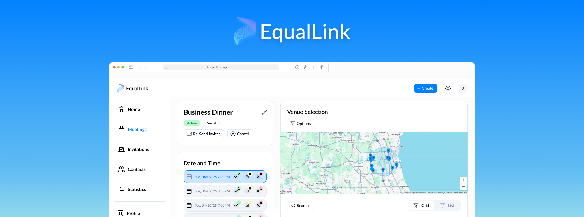
I was brought onto this startup team to help with redesigning their product, designing a brand new webpage to attract new users, and test the user experience of the product. This involved working closely with the CEO and CTO in order to design the functionality and UI of all product features, crafting a product to help people plan in-person meetings with a specific focus on business meetings.
After joining the team, I was tasked with going over a design audit from a third party to draw conclusions about the current state of the product and areas of improvement.
Through this, I discovered many areas where the existing design felt unprofessional, disjointed, and confusing.
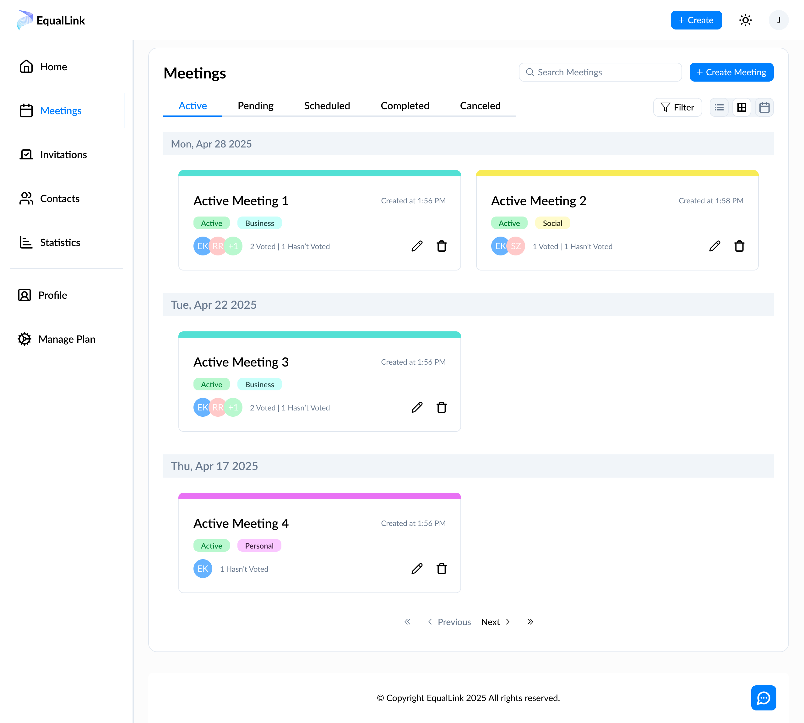
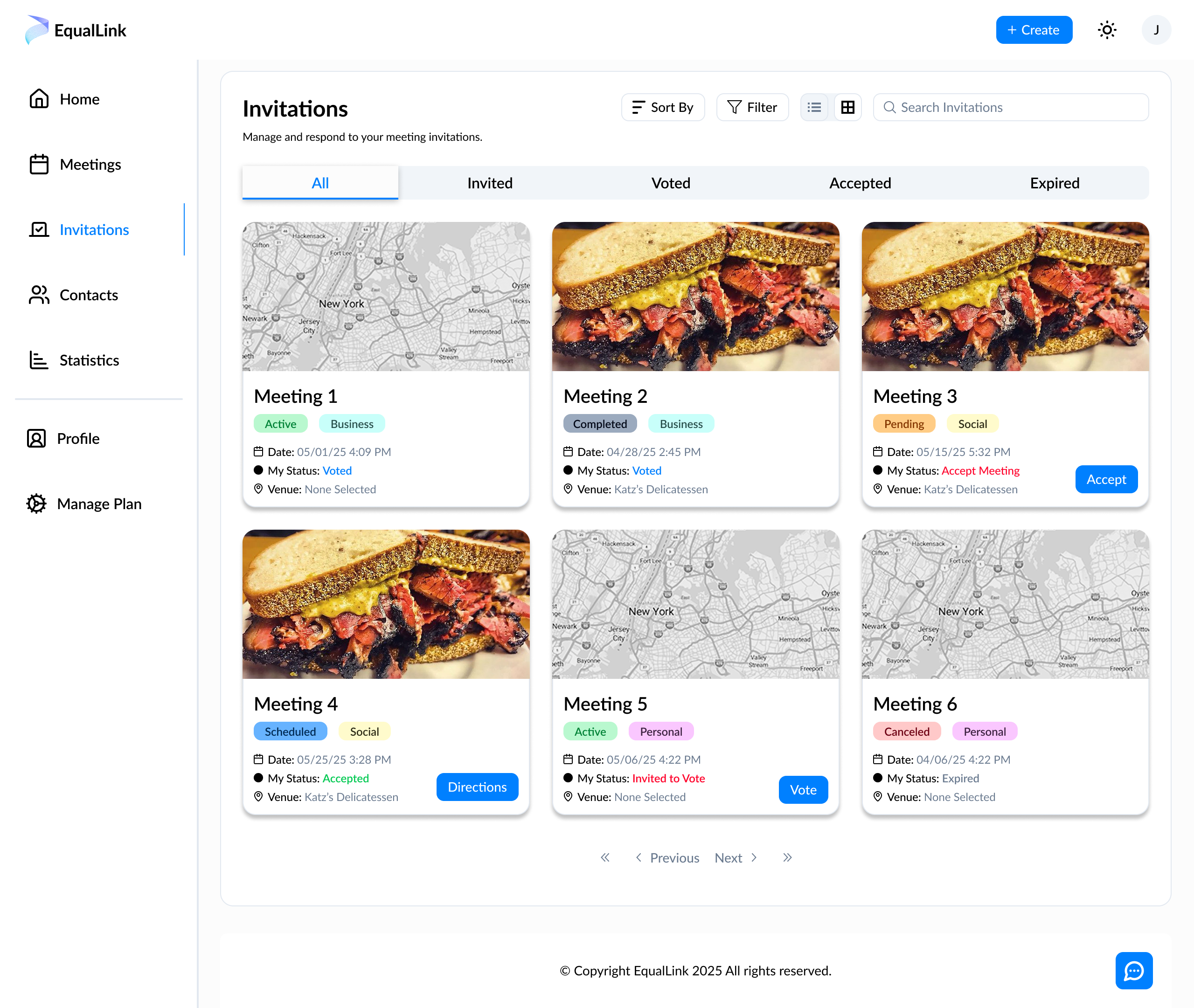
The largest problem facing the product, I found, was the disjointed and often confusing user experience. Prior to hiring me, the team relied solely on infrequent third party design audits to support design decisions. This resulted in everyone on the team designing systems differently without consideration for factors like user experience, KPIs, and the overall user flow.
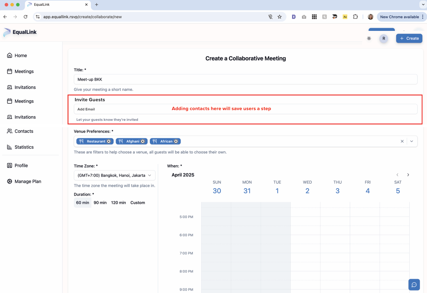
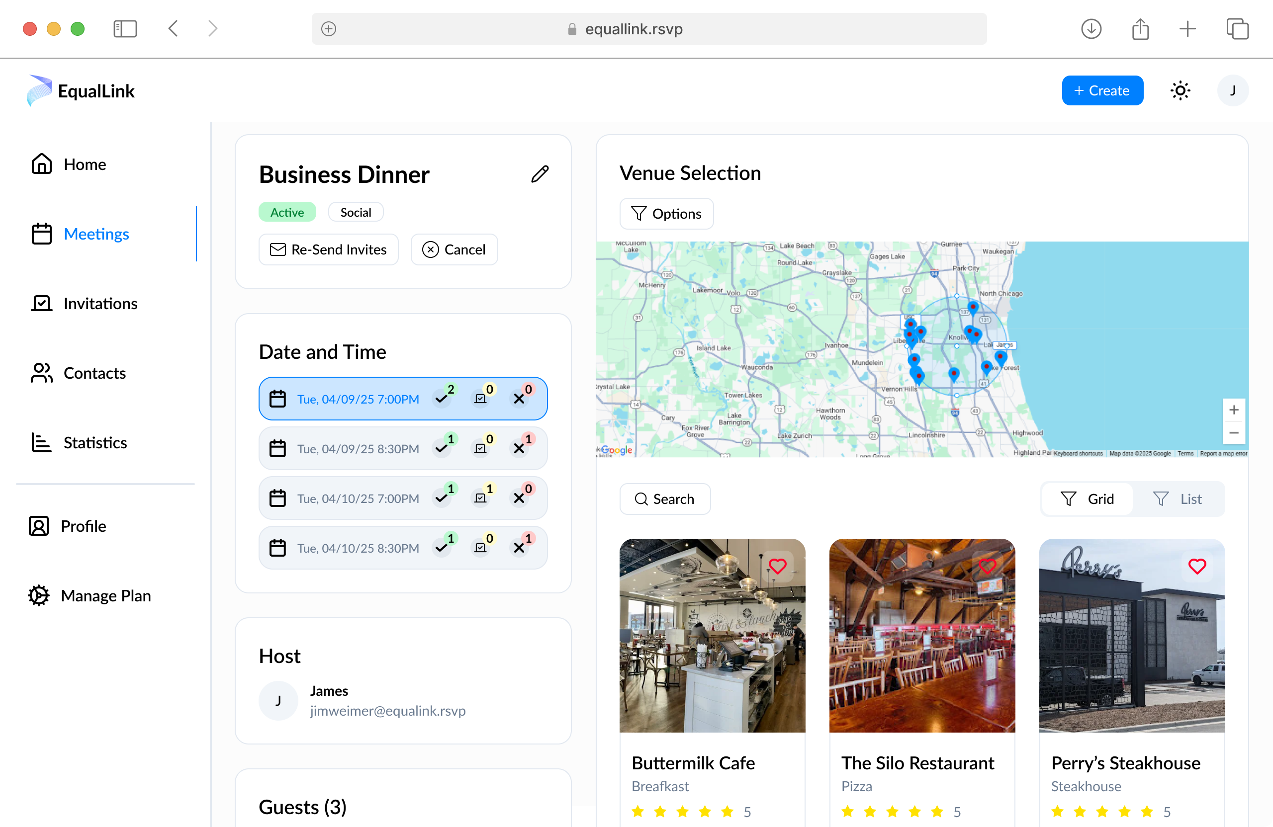
To fix this, I created a design system to apply to all of our future designs and worked closely with the CTO and lead developer to implement changes to the product. From smaller changes like UI and diction, to larger changes concerning the product flow and functionality, I aimed to create a unified and concise experience that felt intuitive and impactful.
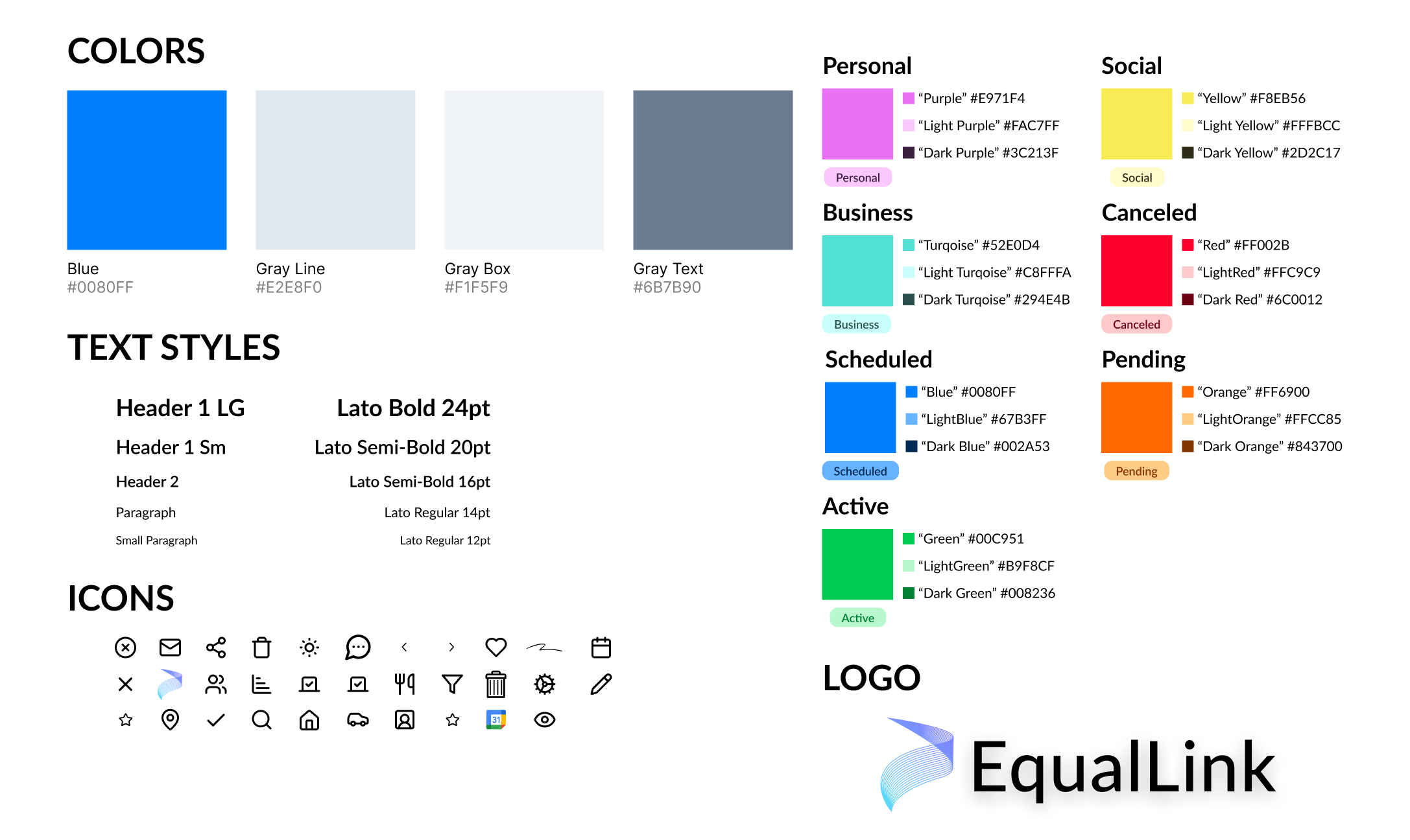
In creating our design system, I chose colors not only for the brand but also to fit each of the different meeting types and the different meetings statuses. I also chose Lato as the font, and created a library of icons we could use throughout the product.
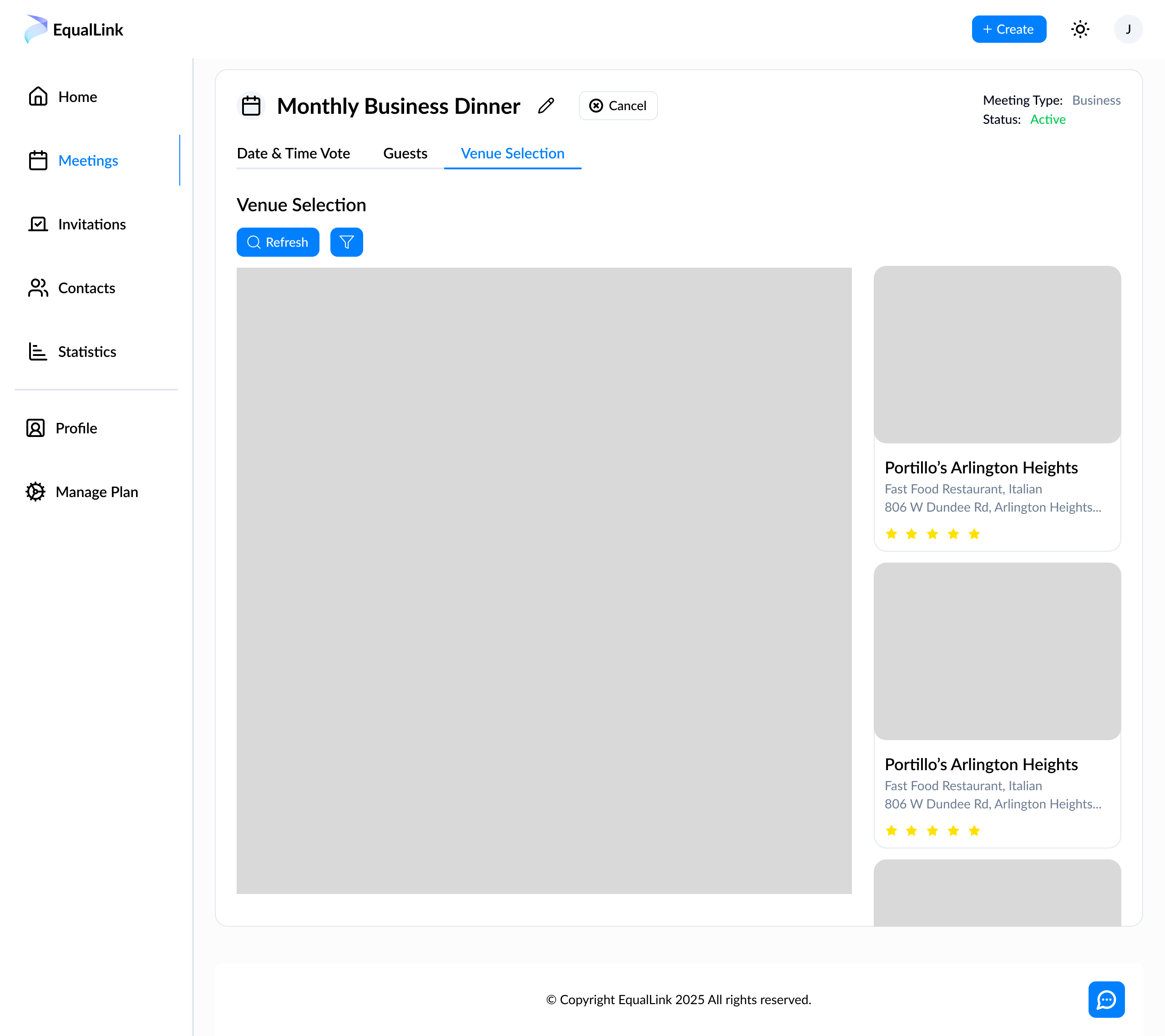
In creating wireframes, I wanted to move away from the disjointed and heavily box-modeled designs that existed and start categorizing information into tabs and steps to simplify the experience for the user. In this image, you can see an early example of the pagination I implemented through tabs.
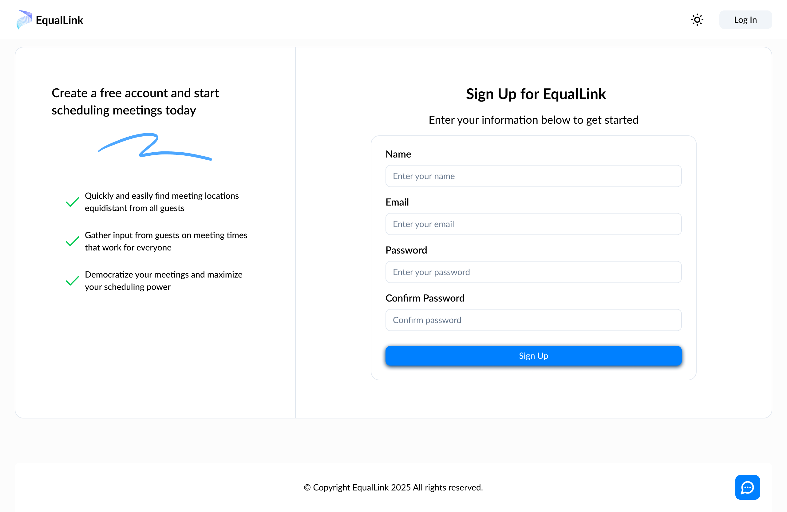
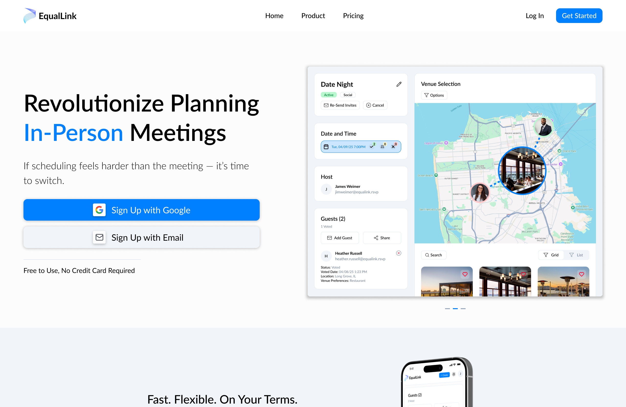
On top of redesigning the product, I redesigned the homepage for the company. With a focus on modernizing the design, I designed mockups with basic animations to showcase the product and our narrative. This included pagination, tabs, sliders, and hover animations.
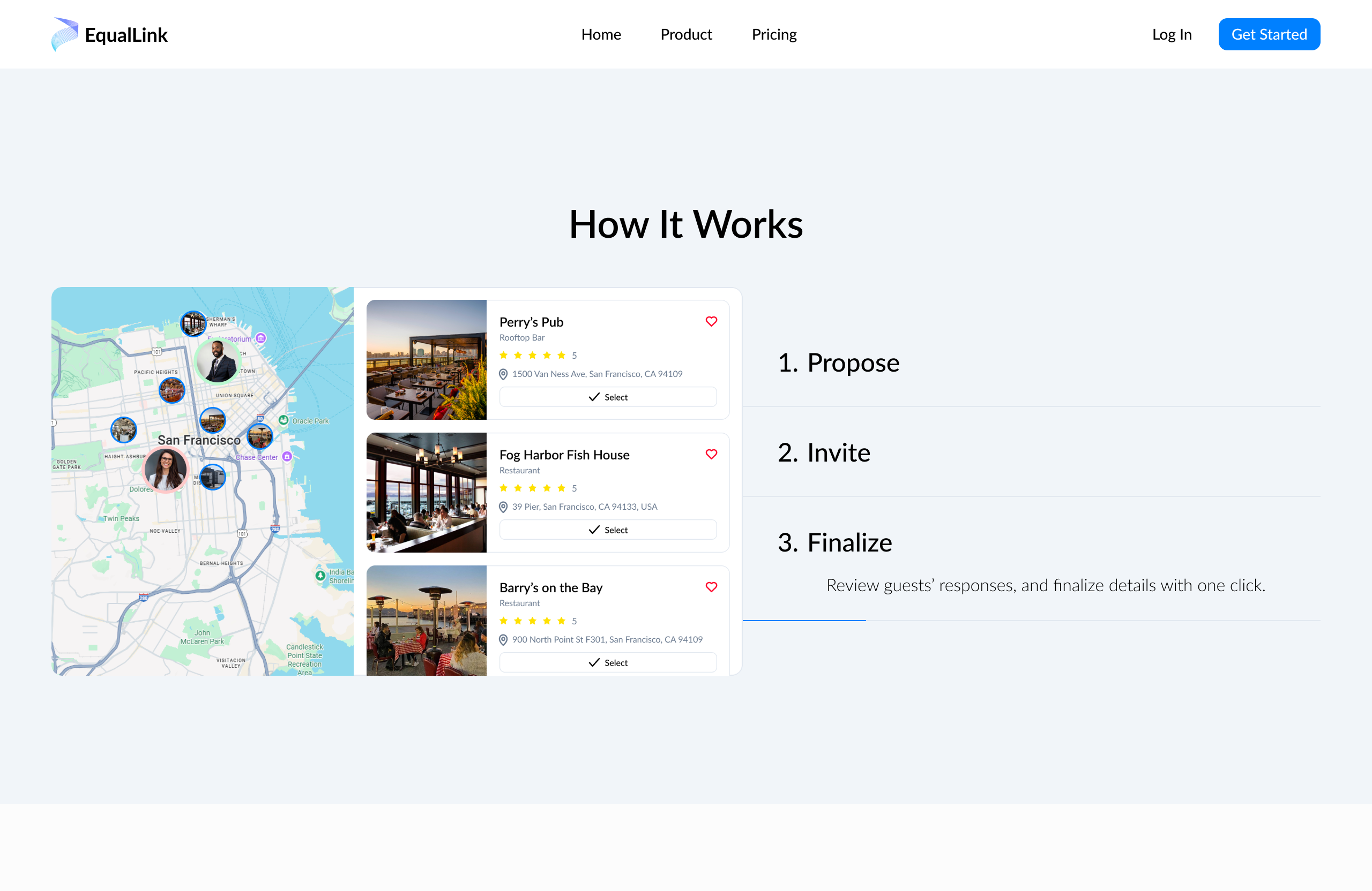
I also created a number of infographics for the homepage. With these, I focused on telling the narrative of our product and introducing new users to the functionality and user flow step-by-step.
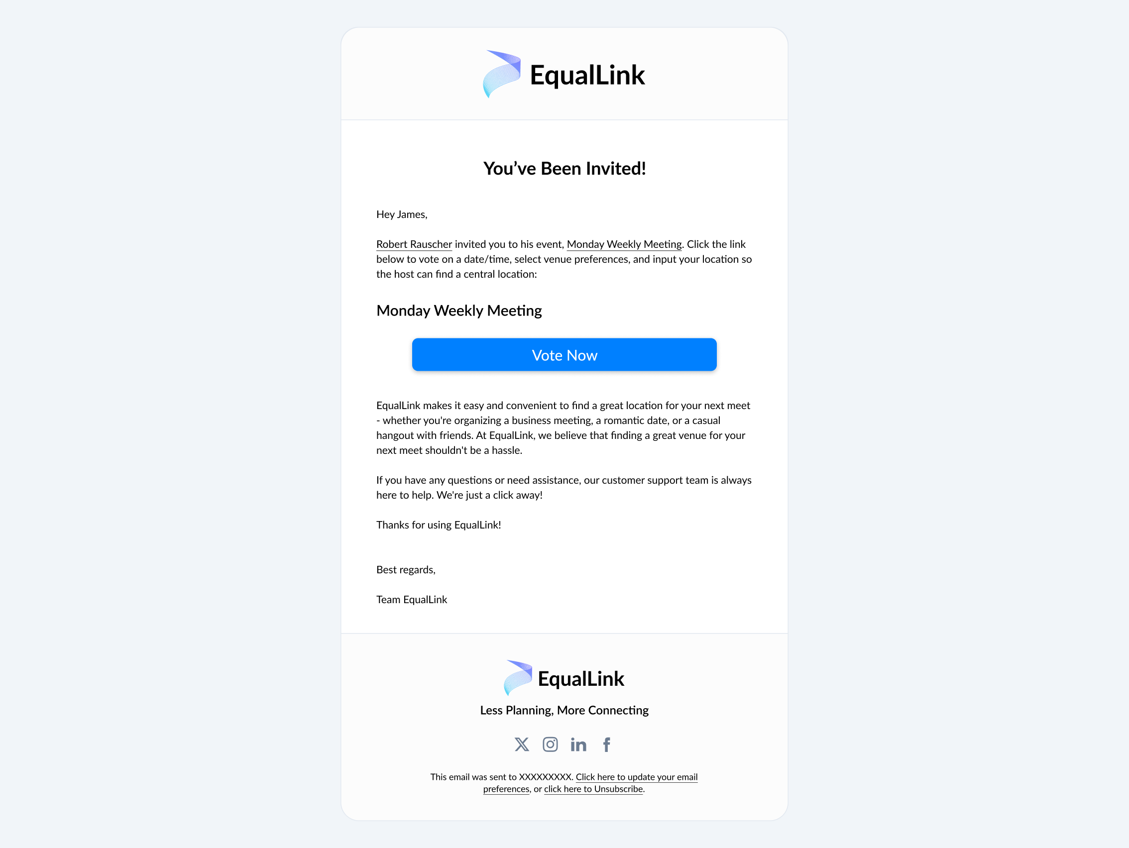
I was also tasked with designing the marketing email for the company’s automated email system. Using influences from other email marketing designs, I create a simple layout which could be used for our various email notifications including verification, meeting invitations, and meet confirmations.
Overall I think EqualLink can be a useful tool for anyone, especially business professionals, who schedule a lot of in-person meetings. With EqualLink, hosts can quickly and easily schedule at an equidistant location that everyone likes at a time that works for every guest. I am happy to have been a design lead at this company and can’t wait to see how the product progresses.

Find events near you and save money while drinking with your friends and meeting new people.
Designing an enhanced approach to purchasing clothing online regardless of body types and sizes.
Creating an all-in-one E-Learning platform for students, teachers, parents, and administrators.
I'd love to help with your next project and I'm always available for a chat. If you have any questions or you'd like to get in touch, feel free to contact me.