
As a long-time guitarist, I set out to create a visually appealing and informative website that showcases the fascinating evolution of the guitar over time. I researched the instruments which led to the guitar’s development, experimented with design patterns suited for education, and create my own website using Webflow, iterating from design to launch.
Along with researching the history of the guitar, I looked into how responsive webpages are used to teach information visually.
Looking at award-winning websites with similar information architectures, I learned about their use of interaction, animations, and ability to present information chronologically as users naturally scroll down the page.

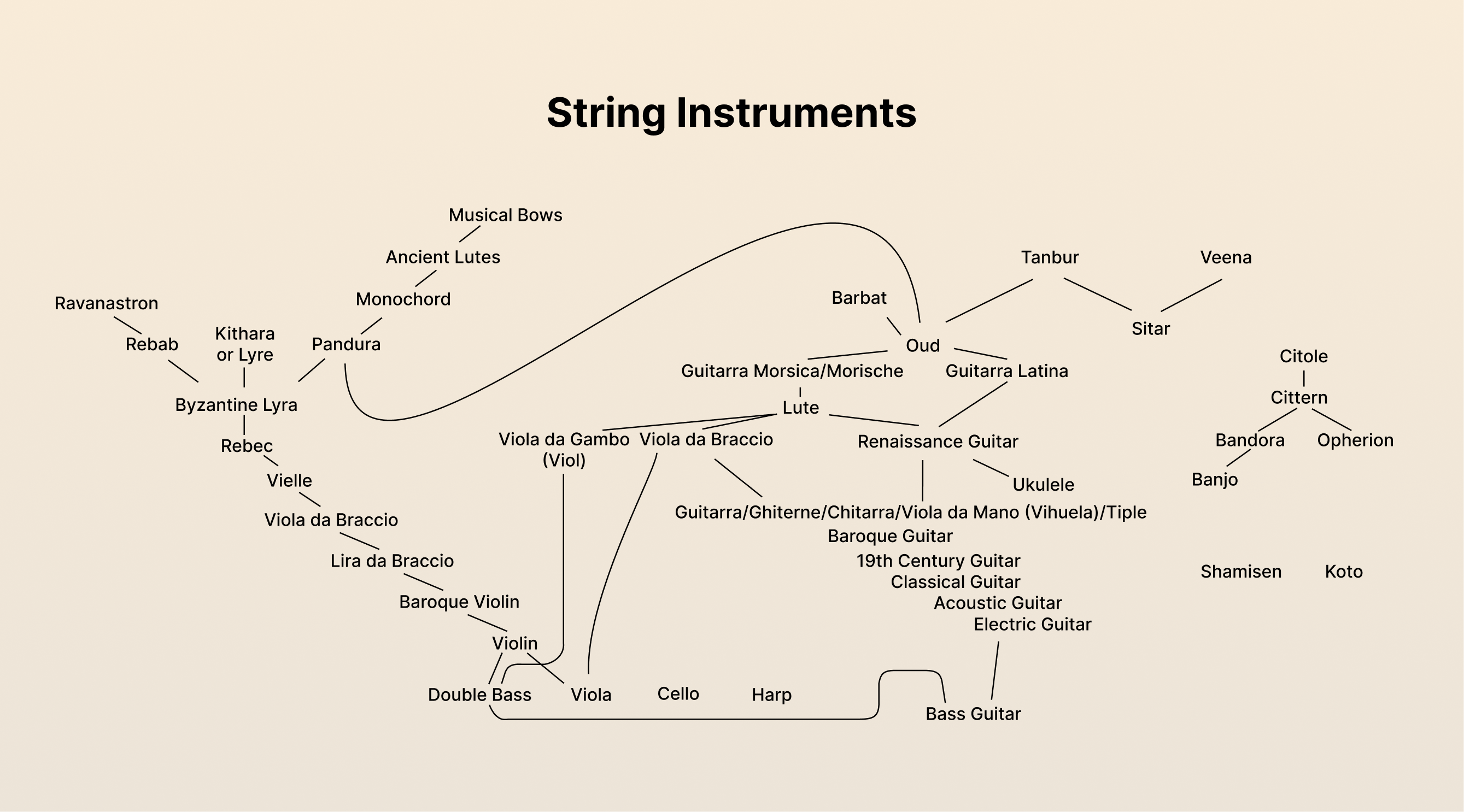
In creating a family tree of instruments which influenced the modern guitar, I found there were far too many to include in this project. In order to the narrative simple and visually appealing, I needed to narrow down my options to a single part of the tree that I could explore in more detail.
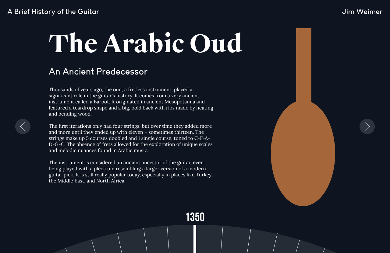
Even when limiting my research to primary-sourced instruments with bodies, necks, and strings, the amount of instruments which could have influenced the guitar was vast and multicultural. This made research on the subject limited to certain instruments, like the oud, and its ancestors.

I first created moodboards to compare the designs of timelines and interactive designs, their use of color and typography, and how simple web animations enhance user experience and allow for interaction with information.
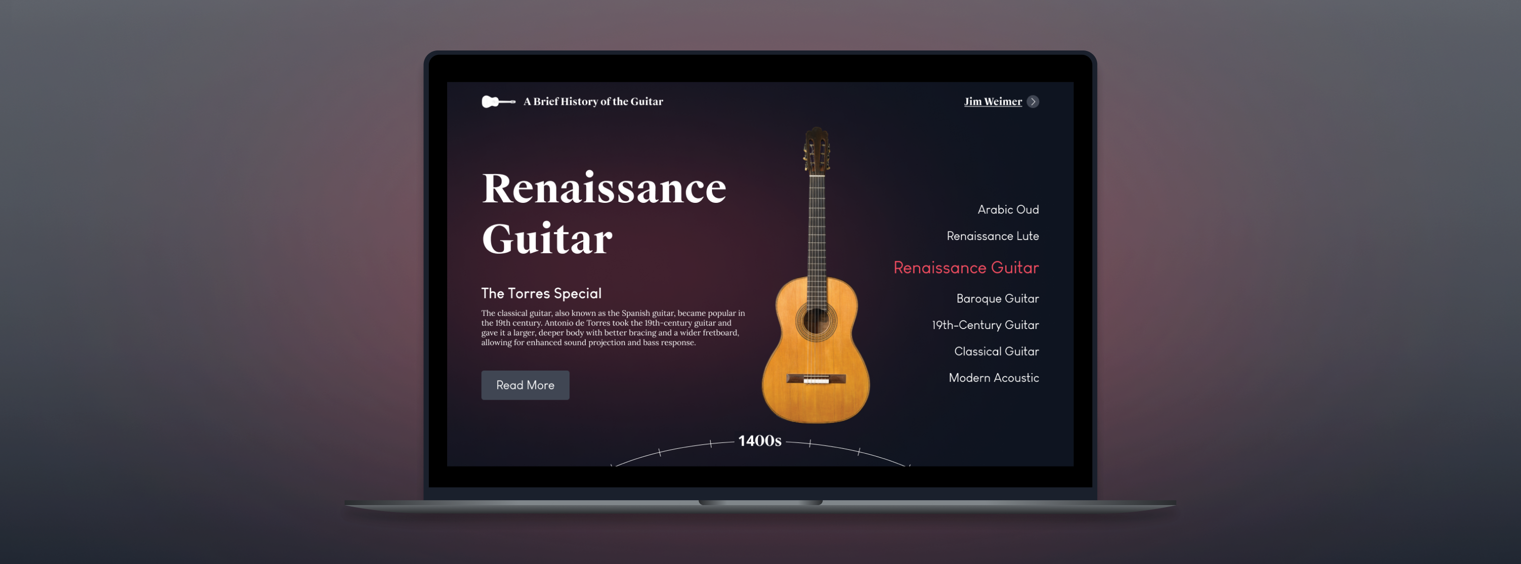
Utilizing a base color, I created my color palette by choosing variant colors for every guitar based on their wood tones. Additionally, I chose a font that felt professional and easy-to-read and designed a simple logo for the site.

In creating low-fidelity prototypes, I considered allowing users to scroll through a revolving carousel of instruments, any of which they could click to learn more about. I also considered image-hover animations with information pop-ups, animated timelines linked to the user’s scroll progress, and even a guitar-shaped interactive timeline.


After some trial and error with implementation on Webflow and HTML/CSS, I completed the project and received further feedback from a panel of design professors at USC.
The feedback I received was overwhelmingly positive, affirming my belief that my designs would be minimal yet usable and could be an effective design for teaching the subject in a simplified manner.
I think my designs in this project were a good start for an effective learning platform, teaching a broad subject in a simplified yet effective way. The right-hand menu gives users a good idea of the extent of the reading available, while the minimalist design and the hidden information overflow gives users who aren’t interested in reading more a good overview of the topic.
Given further time, I would like to expand upon the scope of this project, adding more instruments and designing a “bigger-picture” mode where users can find chronologies of other related instruments; this can include another interactive visual, similar to a family tree, where users can choose a path to follow and learn about the evolution of instruments and their interconnectivity.
Overall, I enjoyed this project and learned a lot about information architecture and user interaction in a minimalist design setting. The skills I learned in HTML/CSS and Webflow also helped me to create this portfolio, which I update every year to continue to develop my skills.

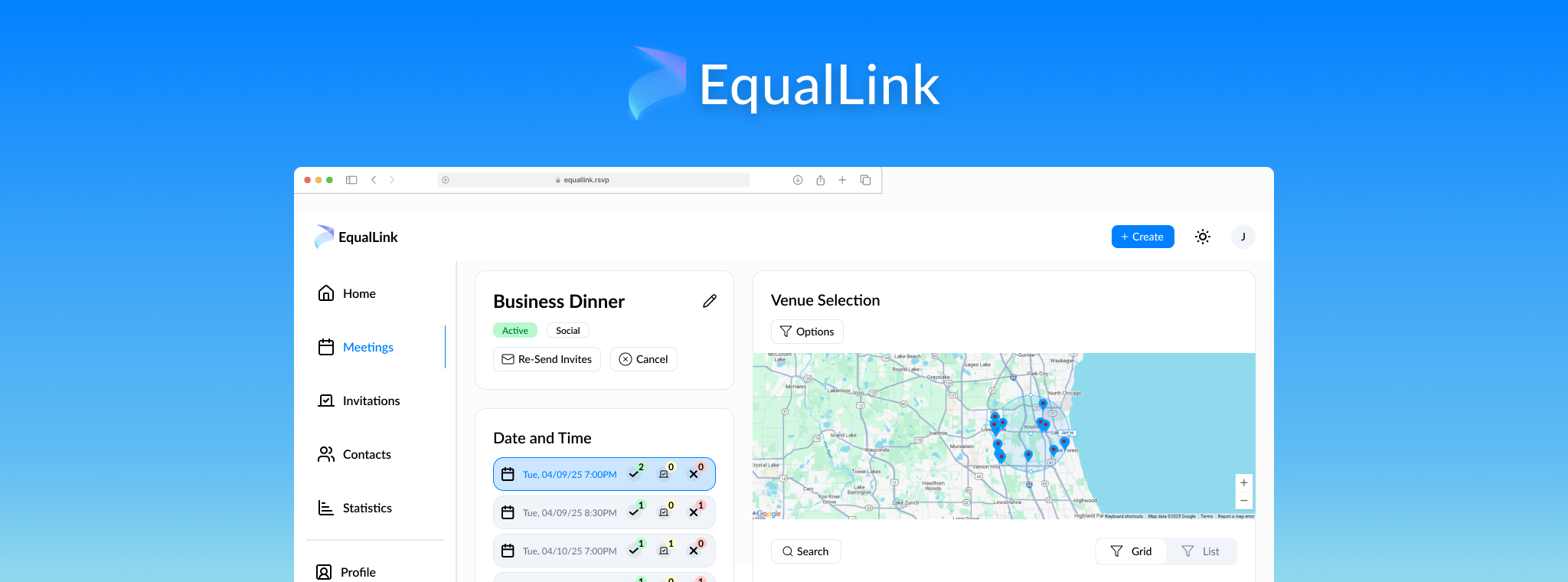
Designing a quick and easy way to schedule equidistant meetings at places everyone will like.
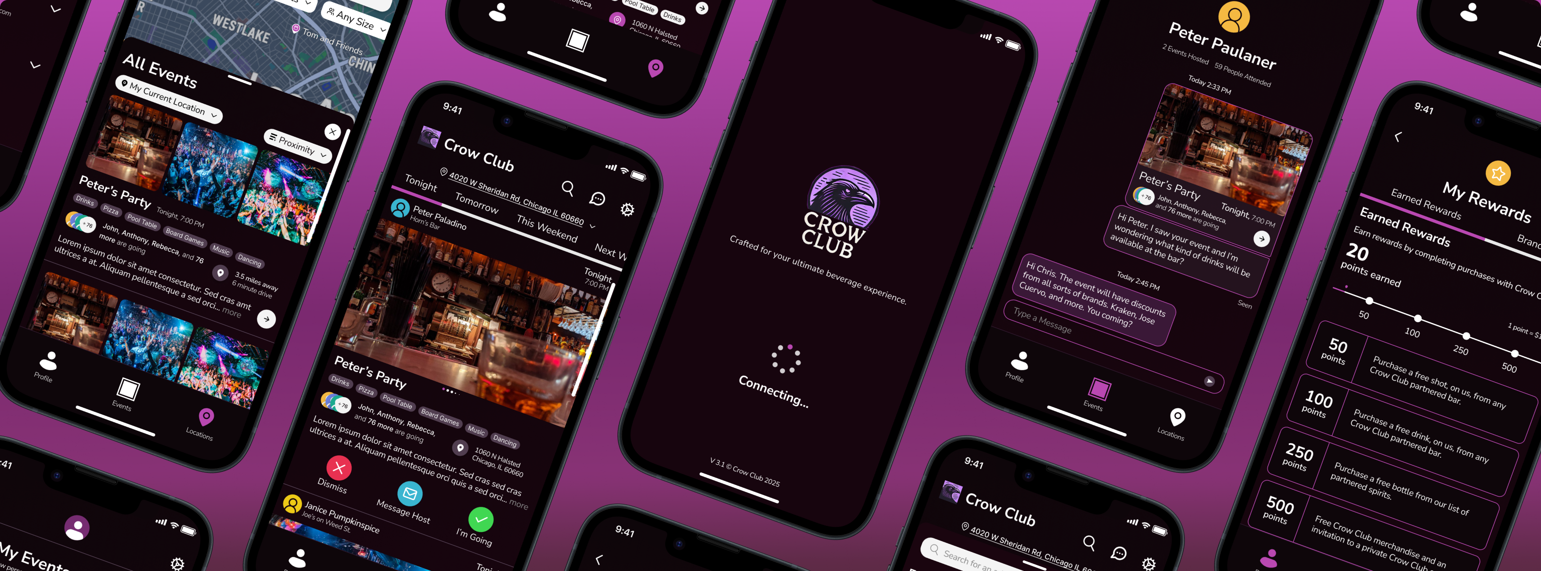
Find events near you and save money while drinking with your friends and meeting new people.
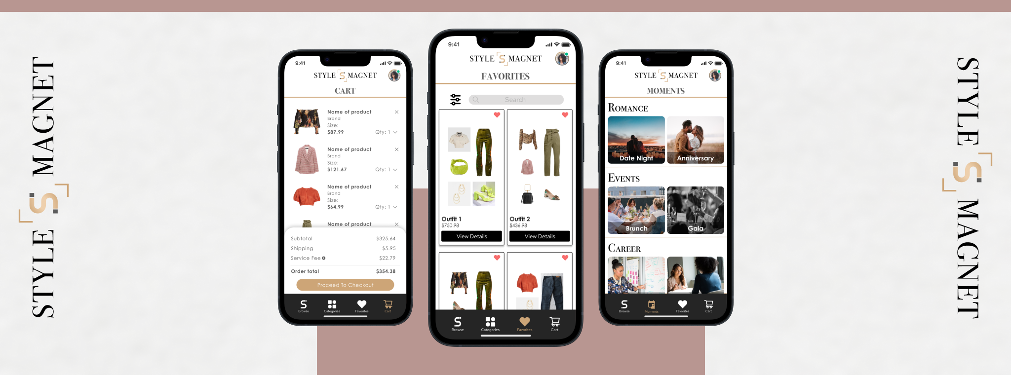
Designing an enhanced approach to purchasing clothing online regardless of body types and sizes.
I'd love to help with your next project and I'm always available for a chat. If you have any questions or you'd like to get in touch, feel free to contact me.